> ## Documentation Index
> Fetch the complete documentation index at: https://docs.viewcomfy.com/llms.txt
> Use this file to discover all available pages before exploring further.
# Build and edit
Building a ViewComfy app is a simple process and can be done via our online [editor](https://editor.viewcomfy.com/) or locally with our [open source solution](https://github.com/ViewComfy/ViewComfy).
We have two video guides to help people get started:
* [Making your first app](https://youtu.be/Su_rbjodvEI)
* [Using the ViewComfy Utils node pack to build advanced apps](https://youtu.be/kMSHMvVe-W8)
## Building the app
To get started, you need to use the workflow\_api.json file from the workflow you want to turn into an app. There are more details on how to get that file [here](/deployments/create_a_deployment_\(deploy_a_workflow\)).
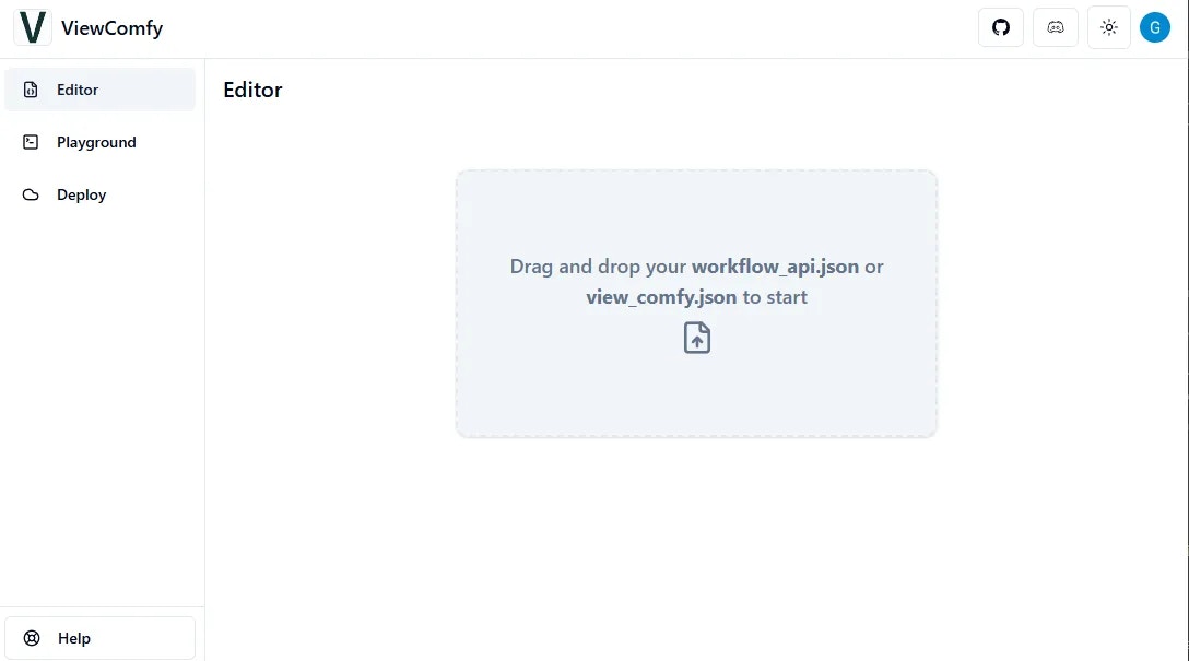
Once you have the file ready, you just need to drop it in the editor.
 After clicking "Save changes", you can add more workflows to the same app by using the "Add Workflow" button.
## Editing the app
After clicking "Save changes", you can add more workflows to the same app by using the "Add Workflow" button.
## Editing the app
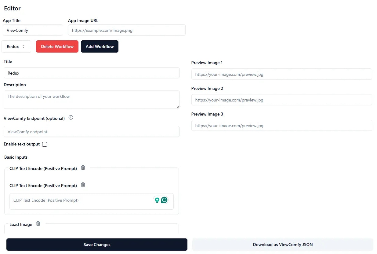 The "App Title" and "App Image URL" allow you to brand your app. Note that you need to provide a URL for the image, meaning it needs to be hosted somewhere.
The "Title" will be the name of your workflow. If you have multiple ones, they will appear in a dropdown at the top.
## Link your App with the ViewComfy Cloud API Endpoint
The "ViewComfy Endpoint" is the API link to your [deployment](/deployments/description). The deployment is where the workflow you used to make the app will run (ei. generate content).
With the latest update of our cloud, you can simply select the name of the deployment you want to use to run your workflow using the dropdown. Alternatively, you can get the endpoint from your workflow dashboard.
The "App Title" and "App Image URL" allow you to brand your app. Note that you need to provide a URL for the image, meaning it needs to be hosted somewhere.
The "Title" will be the name of your workflow. If you have multiple ones, they will appear in a dropdown at the top.
## Link your App with the ViewComfy Cloud API Endpoint
The "ViewComfy Endpoint" is the API link to your [deployment](/deployments/description). The deployment is where the workflow you used to make the app will run (ei. generate content).
With the latest update of our cloud, you can simply select the name of the deployment you want to use to run your workflow using the dropdown. Alternatively, you can get the endpoint from your workflow dashboard.
 By default, the editor will load all the parameters in the workflow. You can remove parameters by clicking the bin icon next to each of them.
You can also add preview images to show your users the kind of output the app will generate. Again, you will need a URL to add the images.
## Editing inputs
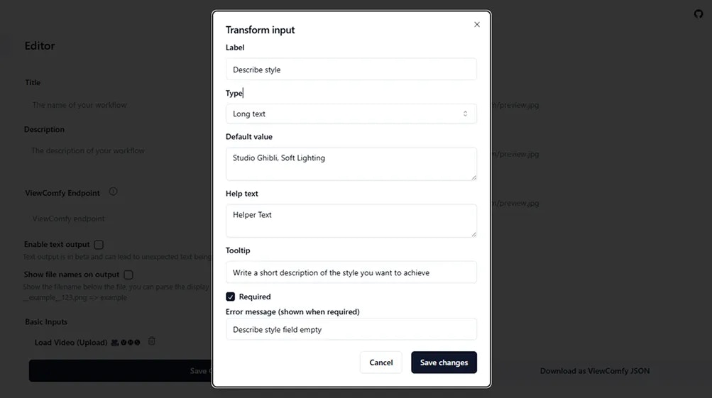
In the app editor, you can delete the parameters you don't want to expose, update default values and control the way your inputs will be displayed.
To update the default value of an input you don't want to expose in the UI, you need to hide it instead of deleting it. Deleting it will revert to the value that was saved in the workflow\_api file you used to create the app.
Using the input menu, you can change the following input properties:
* input name (label)
* input type
* validation values
* default values (in cases where you want to expose the input to the user)
* add help text, tooltip and custom error messages
By default, the editor will load all the parameters in the workflow. You can remove parameters by clicking the bin icon next to each of them.
You can also add preview images to show your users the kind of output the app will generate. Again, you will need a URL to add the images.
## Editing inputs
In the app editor, you can delete the parameters you don't want to expose, update default values and control the way your inputs will be displayed.
To update the default value of an input you don't want to expose in the UI, you need to hide it instead of deleting it. Deleting it will revert to the value that was saved in the workflow\_api file you used to create the app.
Using the input menu, you can change the following input properties:
* input name (label)
* input type
* validation values
* default values (in cases where you want to expose the input to the user)
* add help text, tooltip and custom error messages
 ## Using the mask editor
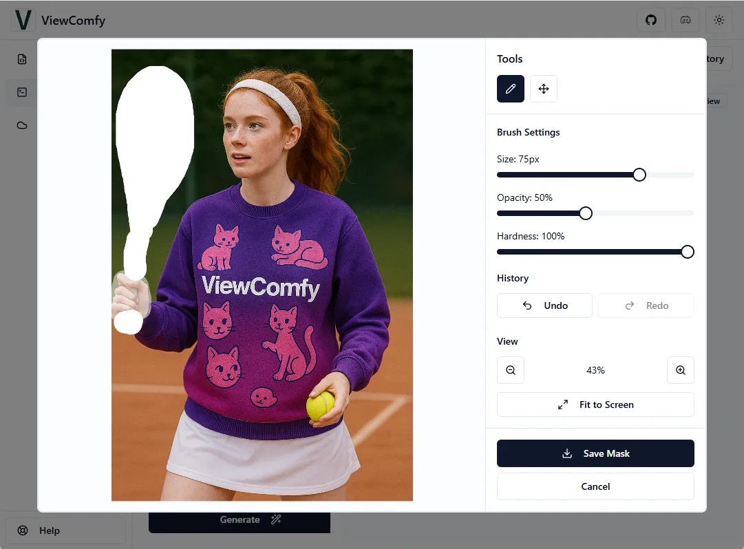
To allow your users to apply a mask on the images they use as input, you need to select the "Image with Mask Editor" input type. This input type behaves the same way as the load image node in ComfyUI.
## Using the mask editor
To allow your users to apply a mask on the images they use as input, you need to select the "Image with Mask Editor" input type. This input type behaves the same way as the load image node in ComfyUI.
 ## managing outputs
Supported output types are rendered by their [mime-type](https://developer.mozilla.org/en-US/docs/Web/HTTP/Guides/MIME_types/Common_types)
* Image (image/)
* Video (video/)
* Audio (audio/)
* Text (.txt)
* PSD Files (image/vnd.adobe.photoshop)
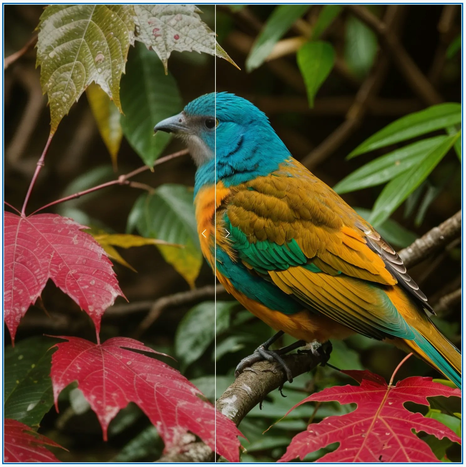
#### Compare images side by side
You can compare any two images using the compare output feature
## managing outputs
Supported output types are rendered by their [mime-type](https://developer.mozilla.org/en-US/docs/Web/HTTP/Guides/MIME_types/Common_types)
* Image (image/)
* Video (video/)
* Audio (audio/)
* Text (.txt)
* PSD Files (image/vnd.adobe.photoshop)
#### Compare images side by side
You can compare any two images using the compare output feature
 #### Display text
To display text, you need to save the text in your workflow using the "save text" node from our [utils node pack](/viewcomfy_apps/utils_node_pack) and enable text output in the app editor.
#### Display text
To display text, you need to save the text in your workflow using the "save text" node from our [utils node pack](/viewcomfy_apps/utils_node_pack) and enable text output in the app editor.
 #### Display the name of the output file
You can enable this option to display the file name in the output section of the playground
#### Display the name of the output file
You can enable this option to display the file name in the output section of the playground

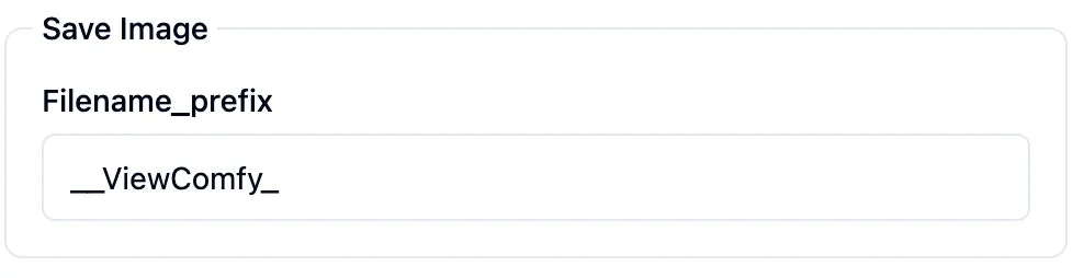
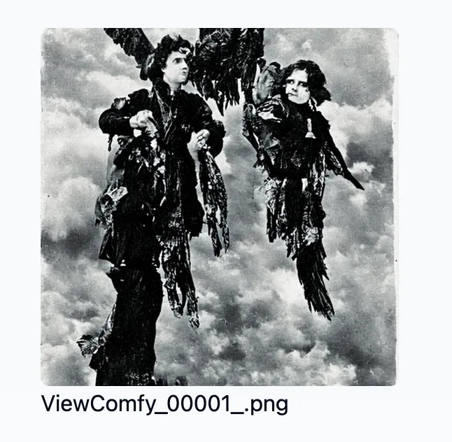 If you surround the file name with `__`, for example: `__text__`, the text between ' \_\_' will be shown instead.
* In the case of the SaveImage Node, it will automatically add an \_ to the file name, that's why you should only add 1 after the name, like in the picture
If you surround the file name with `__`, for example: `__text__`, the text between ' \_\_' will be shown instead.
* In the case of the SaveImage Node, it will automatically add an \_ to the file name, that's why you should only add 1 after the name, like in the picture
 #### Example creating a PSD file Output
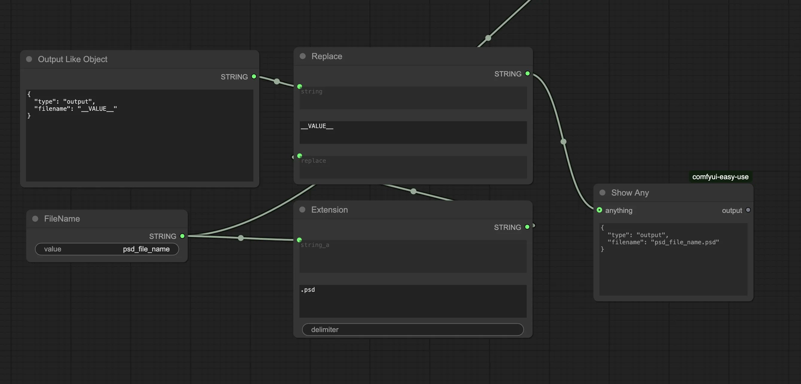
To create a .psd file that ViewComfy can display in the playground page, you need to connect it to a "Show Any" node and make sure that the output has the following shape.
```
{
"type": "output",
"filename": "psd_file_name.psd"
}
```
You can find an example workflow\_api.json [here](https://github.com/ViewComfy/cloud-public/tree/main/workflows/psd-file) that uses this feature with the string core nodes.
#### Example creating a PSD file Output
To create a .psd file that ViewComfy can display in the playground page, you need to connect it to a "Show Any" node and make sure that the output has the following shape.
```
{
"type": "output",
"filename": "psd_file_name.psd"
}
```
You can find an example workflow\_api.json [here](https://github.com/ViewComfy/cloud-public/tree/main/workflows/psd-file) that uses this feature with the string core nodes.
 ## Editing the app (Advanced)
It is also possible to make more advanced edits to the apps by making changes directly in the view\_comfy.json file. If you use Cursor, you can use our [Cursor Rule](https://github.com/ViewComfy/ViewComfy/blob/main/.cursor/rules/view-comfy-json-rules.mdc) to help you. (We have some examples on how to do that [here](https://www.viewcomfy.com/blog/comfyui-to-web-app-in-less-than-5-minutes)).
### Supported input types
* text
* long-text
* number
* boolean
* video
* image
* audio
* seed => seed, noise\_seed, rand\_seed
* number slider => with min, max and step.
* select => list of options (label and value) e.g:
```json theme={null}
{
"label": "Depth",
"value": "Depth"
}
```
#### view\_comfy.json file structure
You can download the view\_comfy.json file from the editor ("Download as ViewComfy JSON").
The section of the json file called "viewComfyJSON" is what defines the UI elements inside the app. More specifically, the "input" and "advancedInputs" sections are the ones that define the parameters.
```json theme={null}
"viewComfyJSON": {
"title": "Controlnet",
"description": "",
"viewcomfyEndpoint": "https://viewcomfy--108-3-td5l2v-comfyui-infer.modal.run",
"previewImages": [
null,
null,
null
],
"inputs": [
{
"title": "Load Image",
"inputs": [
{
"title": "Load Image",
"placeholder": "Load Image",
"value": null,
"workflowPath": [
"17",
"inputs",
"image"
],
"helpText": "Helper Text",
"valueType": "image",
"validations": {
"required": true
},
"key": "17-inputs-image"
}
],
"key": "17-LoadImage"
},
{
"title": "CLIP Text Encode (Positive Prompt)",
"inputs": [
{
"title": "CLIP Text Encode (Positive Prompt)",
"placeholder": "CLIP Text Encode (Positive Prompt)",
"value": "A picture of the ViewComfy jersey",
"workflowPath": [
"23",
"inputs",
"text"
],
"helpText": "Helper Text",
"valueType": "long-text",
"validations": {
"required": true
},
"key": "23-inputs-text"
}
],
"key": "23-CLIPTextEncode"
}
],
"advancedInputs": [
{
"title": "String",
"inputs": [
{
"title": "Value",
"placeholder": "Value",
"value": "Depth",
"workflowPath": [
"37",
"inputs",
"value"
],
"helpText": "Helper Text",
"valueType": "string",
"validations": {
"required": true
},
"key": "37-inputs-value"
}
],
"key": "37-String"
}
],
"id": "452c9cee8f9128"
}
```
The key things to know are:
* The input name in the UI is the input "title"
* Default values are stored in "value"
* The UI will render the inputs in the same order as in the json
* You can create dropdowns by changing the input type to select and adding a list of labels.
#### Rename parameters
So, for example, you can rename the "CLIP Text Encode (Positive Prompt)" input to "prompt" and remove the default value by changing that input to:
```json theme={null}
{
"title": "Prompt",
"placeholder": "Write a prompt",
"value": "",
"workflowPath": [
"23",
"inputs",
"text"
],
"helpText": "Helper Text",
"valueType": "long-text",
"validations": {
"required": true
},
"key": "23-inputs-text"
}
```
#### Create dropdowns
## Editing the app (Advanced)
It is also possible to make more advanced edits to the apps by making changes directly in the view\_comfy.json file. If you use Cursor, you can use our [Cursor Rule](https://github.com/ViewComfy/ViewComfy/blob/main/.cursor/rules/view-comfy-json-rules.mdc) to help you. (We have some examples on how to do that [here](https://www.viewcomfy.com/blog/comfyui-to-web-app-in-less-than-5-minutes)).
### Supported input types
* text
* long-text
* number
* boolean
* video
* image
* audio
* seed => seed, noise\_seed, rand\_seed
* number slider => with min, max and step.
* select => list of options (label and value) e.g:
```json theme={null}
{
"label": "Depth",
"value": "Depth"
}
```
#### view\_comfy.json file structure
You can download the view\_comfy.json file from the editor ("Download as ViewComfy JSON").
The section of the json file called "viewComfyJSON" is what defines the UI elements inside the app. More specifically, the "input" and "advancedInputs" sections are the ones that define the parameters.
```json theme={null}
"viewComfyJSON": {
"title": "Controlnet",
"description": "",
"viewcomfyEndpoint": "https://viewcomfy--108-3-td5l2v-comfyui-infer.modal.run",
"previewImages": [
null,
null,
null
],
"inputs": [
{
"title": "Load Image",
"inputs": [
{
"title": "Load Image",
"placeholder": "Load Image",
"value": null,
"workflowPath": [
"17",
"inputs",
"image"
],
"helpText": "Helper Text",
"valueType": "image",
"validations": {
"required": true
},
"key": "17-inputs-image"
}
],
"key": "17-LoadImage"
},
{
"title": "CLIP Text Encode (Positive Prompt)",
"inputs": [
{
"title": "CLIP Text Encode (Positive Prompt)",
"placeholder": "CLIP Text Encode (Positive Prompt)",
"value": "A picture of the ViewComfy jersey",
"workflowPath": [
"23",
"inputs",
"text"
],
"helpText": "Helper Text",
"valueType": "long-text",
"validations": {
"required": true
},
"key": "23-inputs-text"
}
],
"key": "23-CLIPTextEncode"
}
],
"advancedInputs": [
{
"title": "String",
"inputs": [
{
"title": "Value",
"placeholder": "Value",
"value": "Depth",
"workflowPath": [
"37",
"inputs",
"value"
],
"helpText": "Helper Text",
"valueType": "string",
"validations": {
"required": true
},
"key": "37-inputs-value"
}
],
"key": "37-String"
}
],
"id": "452c9cee8f9128"
}
```
The key things to know are:
* The input name in the UI is the input "title"
* Default values are stored in "value"
* The UI will render the inputs in the same order as in the json
* You can create dropdowns by changing the input type to select and adding a list of labels.
#### Rename parameters
So, for example, you can rename the "CLIP Text Encode (Positive Prompt)" input to "prompt" and remove the default value by changing that input to:
```json theme={null}
{
"title": "Prompt",
"placeholder": "Write a prompt",
"value": "",
"workflowPath": [
"23",
"inputs",
"text"
],
"helpText": "Helper Text",
"valueType": "long-text",
"validations": {
"required": true
},
"key": "23-inputs-text"
}
```
#### Create dropdowns
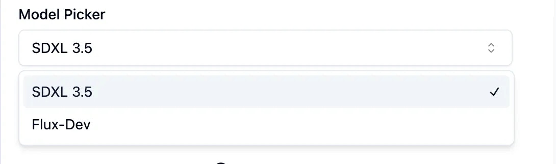 You can create a dropdown for the "String" input where users will be able to select between two types of controlnets by changing the value type for that input to "select", and adding a list of options (the label is what will show in the UI and the value is what will be sent to the node.)
```javascript Dropdown lines theme={null}
{
"title": "String",
"inputs": [
{
"title": "Value",
"placeholder": "Value",
"value": "Depth",
"workflowPath": [
"37",
"inputs",
"value"
],
"helpText": "Helper Text",
"valueType": "select",
"options": [
{
"label": "Depth",
"value": "Depth"
},
{
"label": "Canny",
"value": "Canny"
}
],
"validations": {
"required": true
},
"key": "37-inputs-value"
}
],
"key": "37-String"
}
```
#### Organise parameters
And finally, you can rename that input to "Controlnet type" and bring it to the top (and outside of the advanced input section), so that the viewComfyJSON section of the json ends up looking like this:
```json theme={null}
"viewComfyJSON": {
"title": "Controlnet",
"description": "",
"viewcomfyEndpoint": "https://viewcomfy--1594-1369-mb0g8a-comfyui-infer.modal.run",
"previewImages": [
null,
null,
null
],
"inputs": [
{
"title": "Controlnet type",
"inputs": [
{
"title": "Controlnet type",
"placeholder": "Controlnet type",
"value": "Depth",
"workflowPath": [
"37",
"inputs",
"value"
],
"helpText": "Helper Text",
"valueType": "select",
"options": [
{
"label": "Depth",
"value": "Depth"
},
{
"label": "Canny",
"value": "Canny"
}
],
"validations": {
"required": true
},
"key": "37-inputs-value"
}
],
"key": "37-String"
},
{
"title": "Prompt",
"inputs": [
{
"title": "Prompt",
"placeholder": "Write a prompt",
"value": "",
"workflowPath": [
"23",
"inputs",
"text"
],
"helpText": "Helper Text",
"valueType": "long-text",
"validations": {
"required": true
},
"key": "23-inputs-text"
}
],
"key": "23-CLIPTextEncode"
},
{
"title": "Image",
"inputs": [
{
"title": "Image",
"placeholder": "Image",
"value": null,
"workflowPath": [
"17",
"inputs",
"image"
],
"helpText": "Helper Text",
"valueType": "image",
"validations": {
"required": true
},
"key": "17-inputs-image"
}
],
"key": "17-LoadImage"
}
],
"advancedInputs": [
],
"id": "452c9cee8f9128"
}
```
#### Create sliders
You can create a dropdown for the "String" input where users will be able to select between two types of controlnets by changing the value type for that input to "select", and adding a list of options (the label is what will show in the UI and the value is what will be sent to the node.)
```javascript Dropdown lines theme={null}
{
"title": "String",
"inputs": [
{
"title": "Value",
"placeholder": "Value",
"value": "Depth",
"workflowPath": [
"37",
"inputs",
"value"
],
"helpText": "Helper Text",
"valueType": "select",
"options": [
{
"label": "Depth",
"value": "Depth"
},
{
"label": "Canny",
"value": "Canny"
}
],
"validations": {
"required": true
},
"key": "37-inputs-value"
}
],
"key": "37-String"
}
```
#### Organise parameters
And finally, you can rename that input to "Controlnet type" and bring it to the top (and outside of the advanced input section), so that the viewComfyJSON section of the json ends up looking like this:
```json theme={null}
"viewComfyJSON": {
"title": "Controlnet",
"description": "",
"viewcomfyEndpoint": "https://viewcomfy--1594-1369-mb0g8a-comfyui-infer.modal.run",
"previewImages": [
null,
null,
null
],
"inputs": [
{
"title": "Controlnet type",
"inputs": [
{
"title": "Controlnet type",
"placeholder": "Controlnet type",
"value": "Depth",
"workflowPath": [
"37",
"inputs",
"value"
],
"helpText": "Helper Text",
"valueType": "select",
"options": [
{
"label": "Depth",
"value": "Depth"
},
{
"label": "Canny",
"value": "Canny"
}
],
"validations": {
"required": true
},
"key": "37-inputs-value"
}
],
"key": "37-String"
},
{
"title": "Prompt",
"inputs": [
{
"title": "Prompt",
"placeholder": "Write a prompt",
"value": "",
"workflowPath": [
"23",
"inputs",
"text"
],
"helpText": "Helper Text",
"valueType": "long-text",
"validations": {
"required": true
},
"key": "23-inputs-text"
}
],
"key": "23-CLIPTextEncode"
},
{
"title": "Image",
"inputs": [
{
"title": "Image",
"placeholder": "Image",
"value": null,
"workflowPath": [
"17",
"inputs",
"image"
],
"helpText": "Helper Text",
"valueType": "image",
"validations": {
"required": true
},
"key": "17-inputs-image"
}
],
"key": "17-LoadImage"
}
],
"advancedInputs": [
],
"id": "452c9cee8f9128"
}
```
#### Create sliders
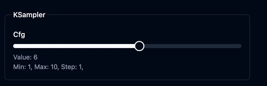 You can create a slider by adding a slider object to a parameter with min, max and step.
```json theme={null}
{
"title": "KSampler",
"inputs": [
{
"title": "Cfg",
"placeholder": "Cfg",
"value": 8,
"workflowPath": [
"3",
"inputs",
"cfg"
],
"helpText": "Helper Text",
"valueType": "slider",
"slider": {
"min": 1,
"max": 10,
"step": 1
},
"validations": {
"required": true
},
"key": "3-inputs-cfg"
}
]
}
```
#### Input Tooltips
You can add tooltips beside your input to add helpful information to the user
You can create a slider by adding a slider object to a parameter with min, max and step.
```json theme={null}
{
"title": "KSampler",
"inputs": [
{
"title": "Cfg",
"placeholder": "Cfg",
"value": 8,
"workflowPath": [
"3",
"inputs",
"cfg"
],
"helpText": "Helper Text",
"valueType": "slider",
"slider": {
"min": 1,
"max": 10,
"step": 1
},
"validations": {
"required": true
},
"key": "3-inputs-cfg"
}
]
}
```
#### Input Tooltips
You can add tooltips beside your input to add helpful information to the user
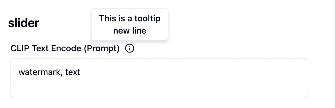 You can add a tooltip by adding a `tooltip` key to a parameter and if you want to add a new line you can add the `\n`
```json theme={null}
{
"title": "Seed",
"placeholder": "Seed",
"value": 40741760227630,
"workflowPath": [
"3",
"inputs",
"seed"
],
"tooltip": "This is a tooltip\n new line",
"helpText": "Helper Text",
"valueType": "seed",
"validations": {
"required": true
},
"key": "3-inputs-seed"
},
```
#### Input Help text
You can add a help text below your input to add guidance information to the user
You can add a tooltip by adding a `tooltip` key to a parameter and if you want to add a new line you can add the `\n`
```json theme={null}
{
"title": "Seed",
"placeholder": "Seed",
"value": 40741760227630,
"workflowPath": [
"3",
"inputs",
"seed"
],
"tooltip": "This is a tooltip\n new line",
"helpText": "Helper Text",
"valueType": "seed",
"validations": {
"required": true
},
"key": "3-inputs-seed"
},
```
#### Input Help text
You can add a help text below your input to add guidance information to the user
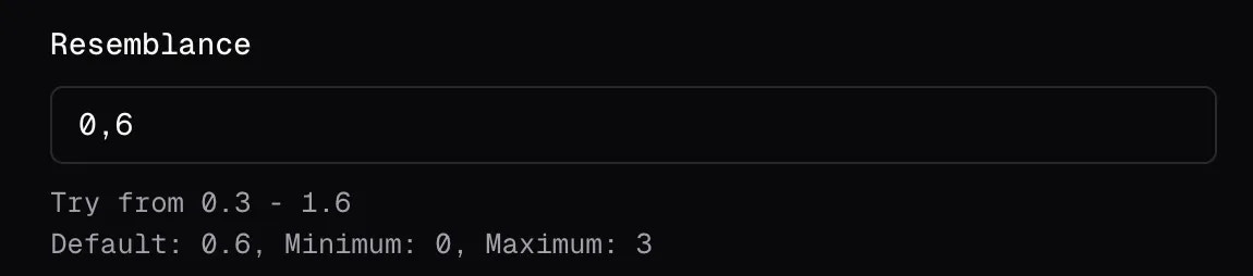 You can add or modify `helpText` key of a parameter and if you want to add a new line you can add the `\n`
```json theme={null}
{
"title": "Seed",
"placeholder": "Seed",
"value": 40741760227630,
"workflowPath": [
"3",
"inputs",
"seed"
],
"helpText": "Helper Text\n new line",
"valueType": "seed",
"validations": {
"required": true
},
"key": "3-inputs-seed"
},
```
You can add or modify `helpText` key of a parameter and if you want to add a new line you can add the `\n`
```json theme={null}
{
"title": "Seed",
"placeholder": "Seed",
"value": 40741760227630,
"workflowPath": [
"3",
"inputs",
"seed"
],
"helpText": "Helper Text\n new line",
"valueType": "seed",
"validations": {
"required": true
},
"key": "3-inputs-seed"
},
```